
Cancer Innovation Challenge
Video + Branding + Illustrations + more
Let's work together
+44 (0) 131 510 8260
Please call +44 (0) 131 510 8260 for more information on any of our creative services.


To reflect Nuleaf’s evolution since it was established in 2003, we were commissioned to undertake a rebranding project for the organisation. They required a new logo design that better represented the brand and Word templates for their core communications.


Caption here
The simplistic yet bold logo marque incorporates the ‘n’ and ‘u’ from Nuleaf to form an infinity symbol. The inspiration for this stems from Nuleaf’s role as a link between the local authorities and government, and the continuous support they provide to communities.

We developed a fresh and contemporary colour palette using blue and green tones. The light green conveys positivity, whilst the understated teal and imperial blue symbolise trust and stability. Combined with a bold san serif logotype, the logo captures Nuleaf’s integrity and reinforces their authority in the industry.

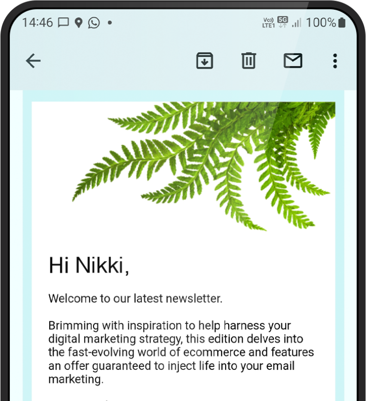
As they are part of government and industry groups and host regular member meetings, it is essential for Nuleaf’s branding to be applied consistently across all communications. We designed professional Word templates for a newsletter, eBulletin, letterhead with continuation sheet and business cards.
Success! We've received your message and will get back to you as soon as possible. We look forward to chatting to you.

“I have worked with Ben and his agency for many years, albeit in a paper promotional capacity. After discussions on an internal project, I was thrilled when he offered to produce work for ourselves.
Ben lead the way with concept to design and produced a great piece, Rock-Paper-Scissors. Feedback from our clients has been excellent and lovely to put a smile on faces when they identify the design. I hope to do more work with Firefly in the future.”
Elaine Scott
Key Account Manager
Antalis