
Recruiting Future
Branding + Word and PowerPoint template design + Logo design + more
Let's work together
+44 (0) 131 510 8260
Please call +44 (0) 131 510 8260 for more information on any of our creative services.
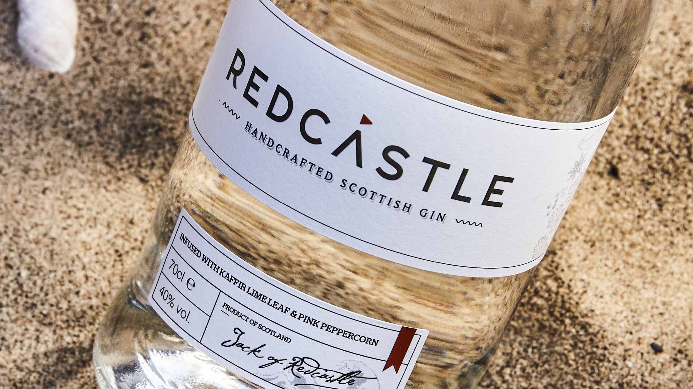
Redcastle commissioned Firefly to develop their gin branding, which included the design of a logo and packaging. The handcrafted Scottish gin was to be positioned at the premium end of the fast-growing market.
We selected a clean, modern sans serif typeface and crafted the typography to remove the crossbar from the letter ‘A’, creating a logotype truly unique to the brand. A simple, red triangle to symbolise a flag on top of a sandcastle was incorporated on top of the letter ‘A’ to further differentiate the logo and allude to a seaside theme. The logo design gives the brand a fresh and contemporary edge, setting them apart from their competitors and helping to differentiate the packaging on shelf in a retail environment.
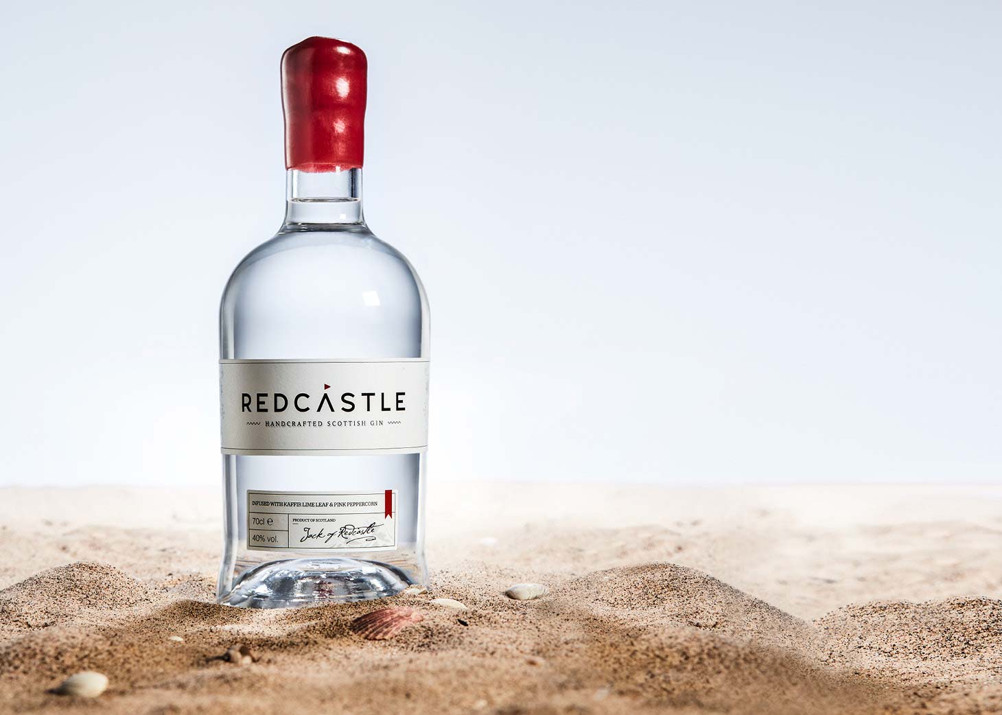
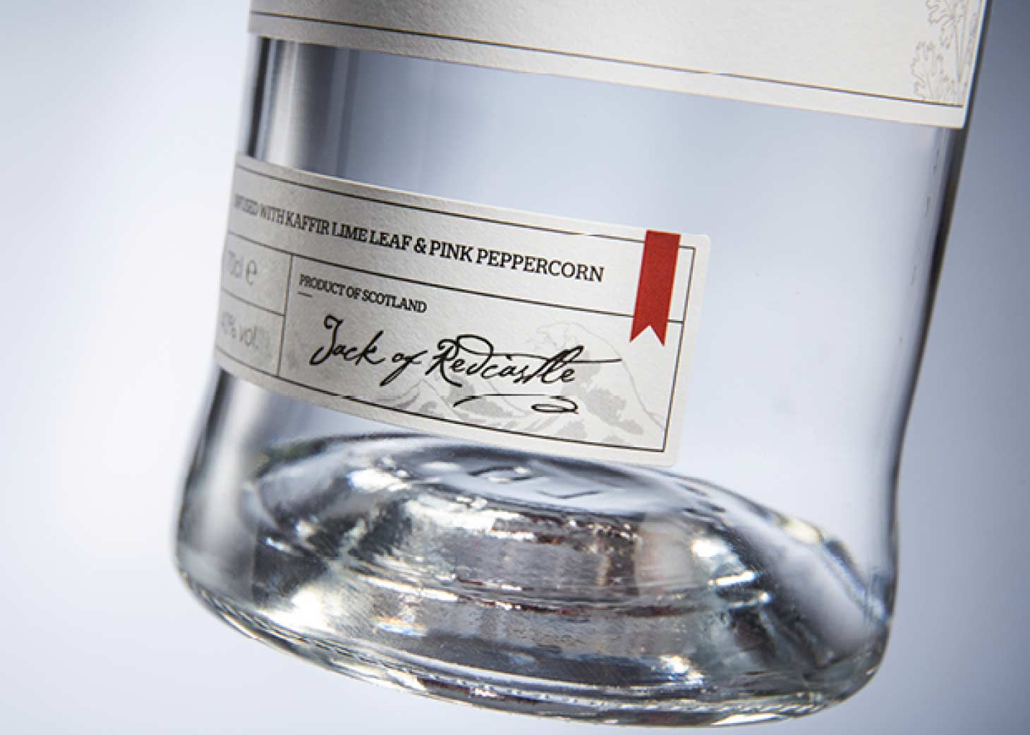
The use of a Serif typeface for the descriptor below the logo type adds a touch of heritage to the design and highlights the quality of the product. This is paired with a wave keyline graphic device, which adds a playful dimension to the logo and subtly reinforces the seaside theme. Intricate illustrations of key ingredients present in the gin were incorporated into the label to reflect the fact that it is expertly handcrafted, whilst adding depth to the design.
The minimal colour palette and simplistic typography create an understated aesthetic. This helps to reinforce the premium nature of the brand and entice the target audience.
Success! We've received your message and will get back to you as soon as possible. We look forward to chatting to you.

“It was a pleasure to work with Firefly on our branding, report templates and new website. We chose to work with them because they took time to understand us at the start of the process and that approach was apparent in all of the high-quality work they produced.”
Graeme Blackett
Director
BiGGAR Economics