Indigo Ag
Print + Brochure design + Exhibitions and displays + more
Let's work together
+44 (0) 131 510 8260
Please call +44 (0) 131 510 8260 for more information on any of our creative services.

Edinburgh University Press approached Firefly to produce two short animations to promote their publications across their website, social media channels and at various events and conferences. Each animation was aimed at prospective customers, primarily academic librarians. They also commissioned us to design a brochure for their 70th anniversary as a publisher, focusing on their history, core aims and personality as a business.
Caption here
After sketching initial storyboards, we created detailed digital versions of all of the illustrative assets we needed to build the animations. Drawing upon the Edinburgh University Press’ existing typography and colour palette, we created a friendly and inclusive design for the animations.
The first animation we created featured the publisher’s Edinburgh Journal Collection. We showcased original journal covers and highlighted key facts and benefits of their publishing services. Our use of vibrant colour, typographic hierarchy, and kinetic typography helped guide the viewer through the animation and communicate information in a clear, succinct, and engaging way.
The second animation showcases 60 years of research in the Edinburgh Archive Collection. It features a person using a tablet device to browse the collection while highlighting key facts. The imagery adds a human touch and positions Edinburgh University Press as an approachable and reliable organisation. To add depth to the videos and help captivate the viewer we sourced and incorporated upbeat instrumental music.
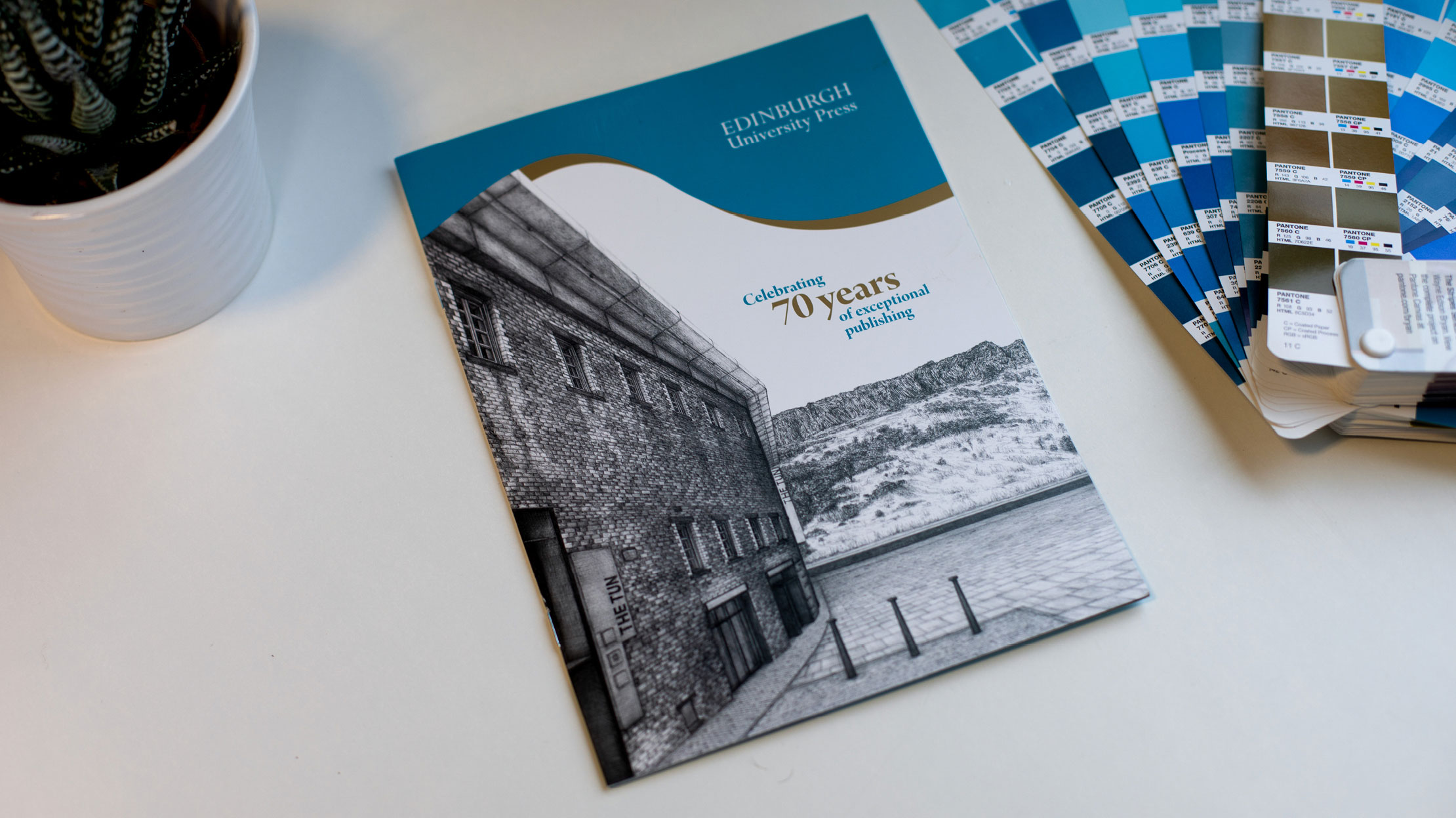
The 70th anniversary brochure features illustrations on the front and inside covers of the brochure of the publisher’s previous and current office buildings, commissioned by Edinburgh-based artist Jennifer Court. These detailed and intricate illustrations allude to the organisation’s longstanding publishing history.

These monochrome illustrations are juxtaposed with pops of bright colour from the brand’s existing colour palette, displayed in the form of playful, organic shapes to capture the reader’s attention. These elements are complimented by the modern serif typeface utilised throughout the brochure design.

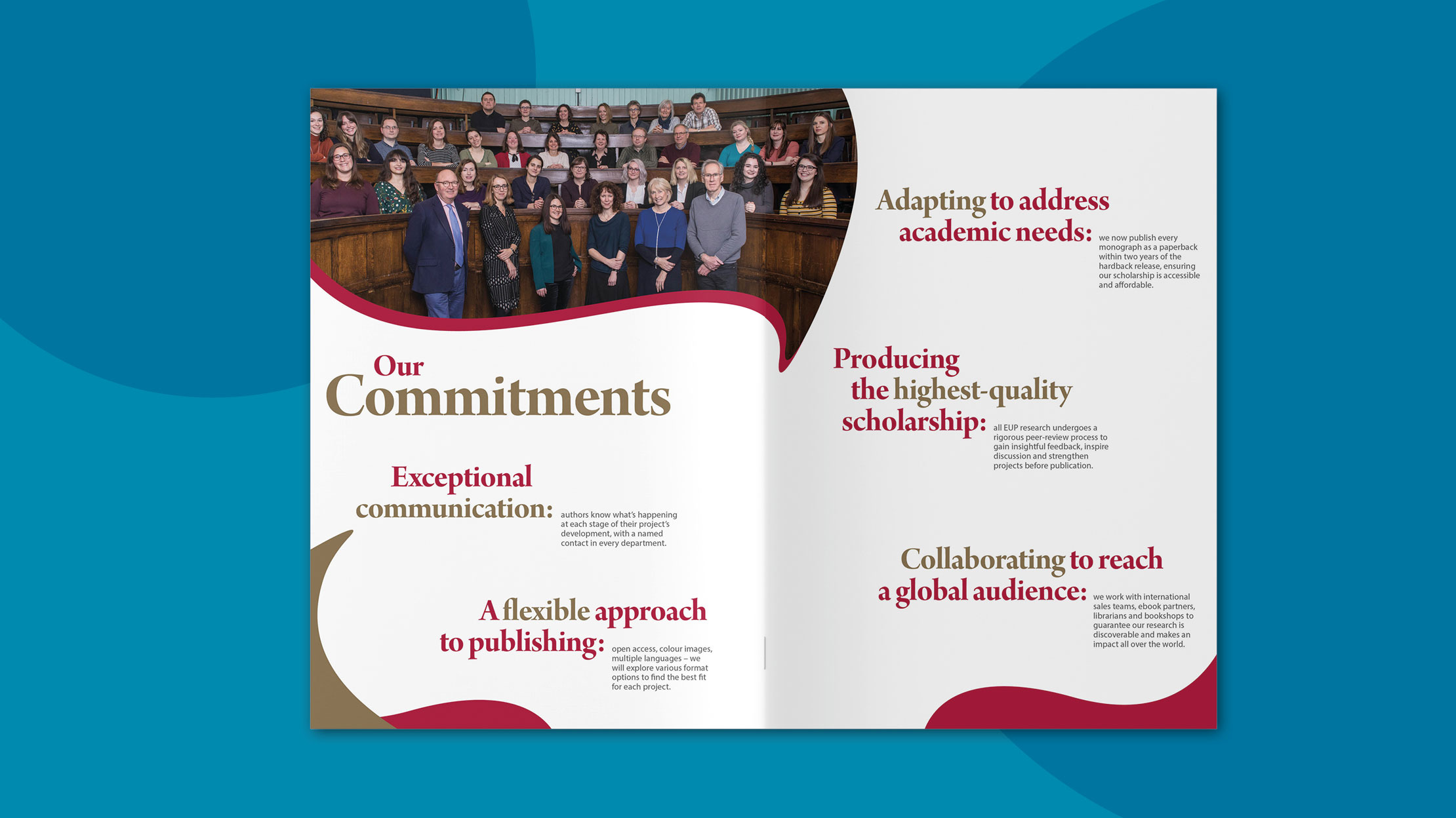
A photograph of the whole team was incorporated to further highlights the friendly, approachable and professional nature of the brand. The combination of the colour palette, graphical shapes, typography and photography adds a contemporary touch, reinforcing the business’s aim to provide a fresh approach to publishing.
Success! We've received your message and will get back to you as soon as possible. We look forward to chatting to you.
Carol Harris
Communications and Public Affairs Manager
The Royal College of Nursing Scotland