
Business Knights
Print + Branding + Brochure design
Let's work together
+44 (0) 131 510 8260
Please call +44 (0) 131 510 8260 for more information on any of our creative services.
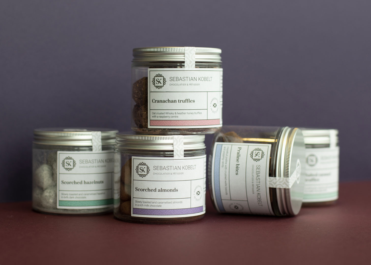
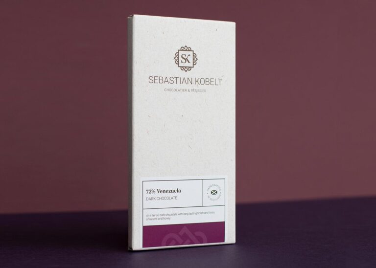
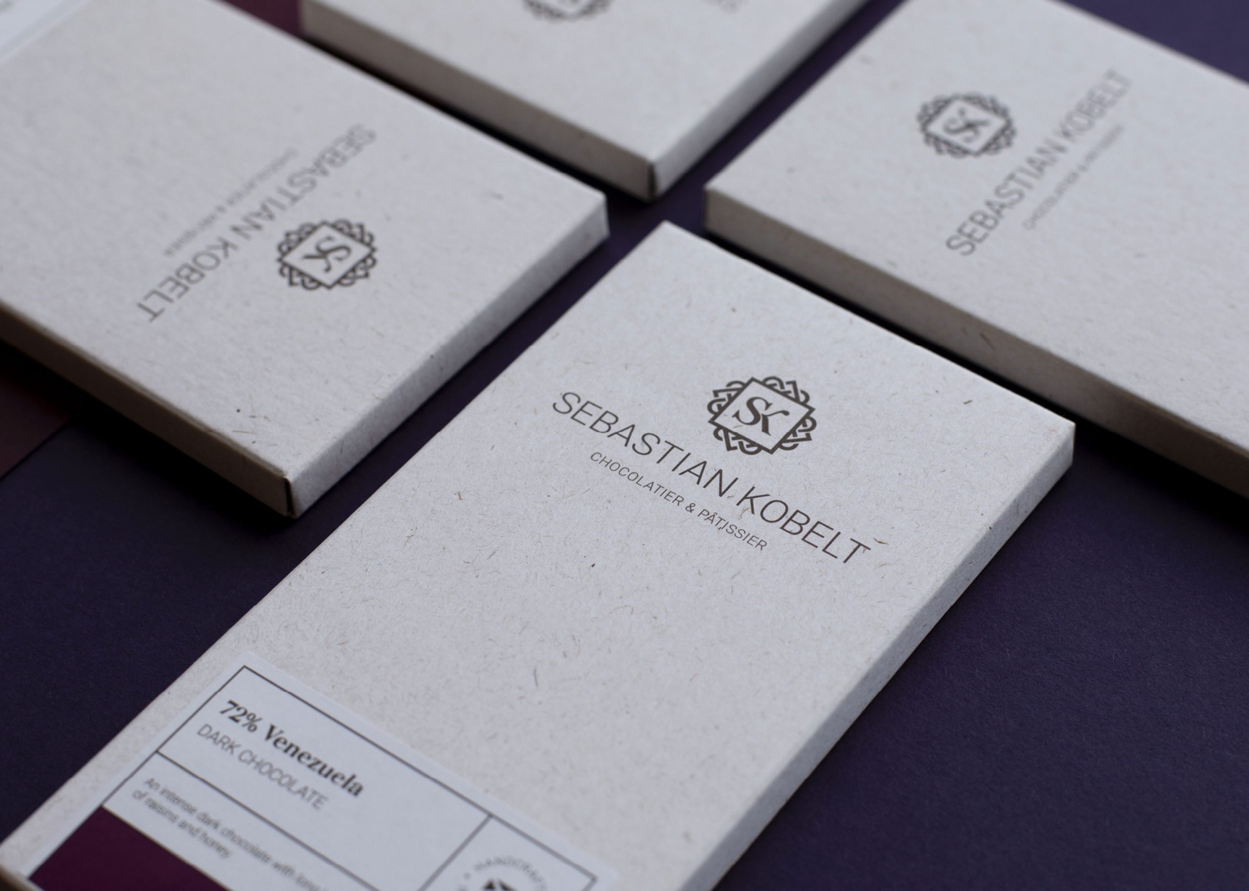
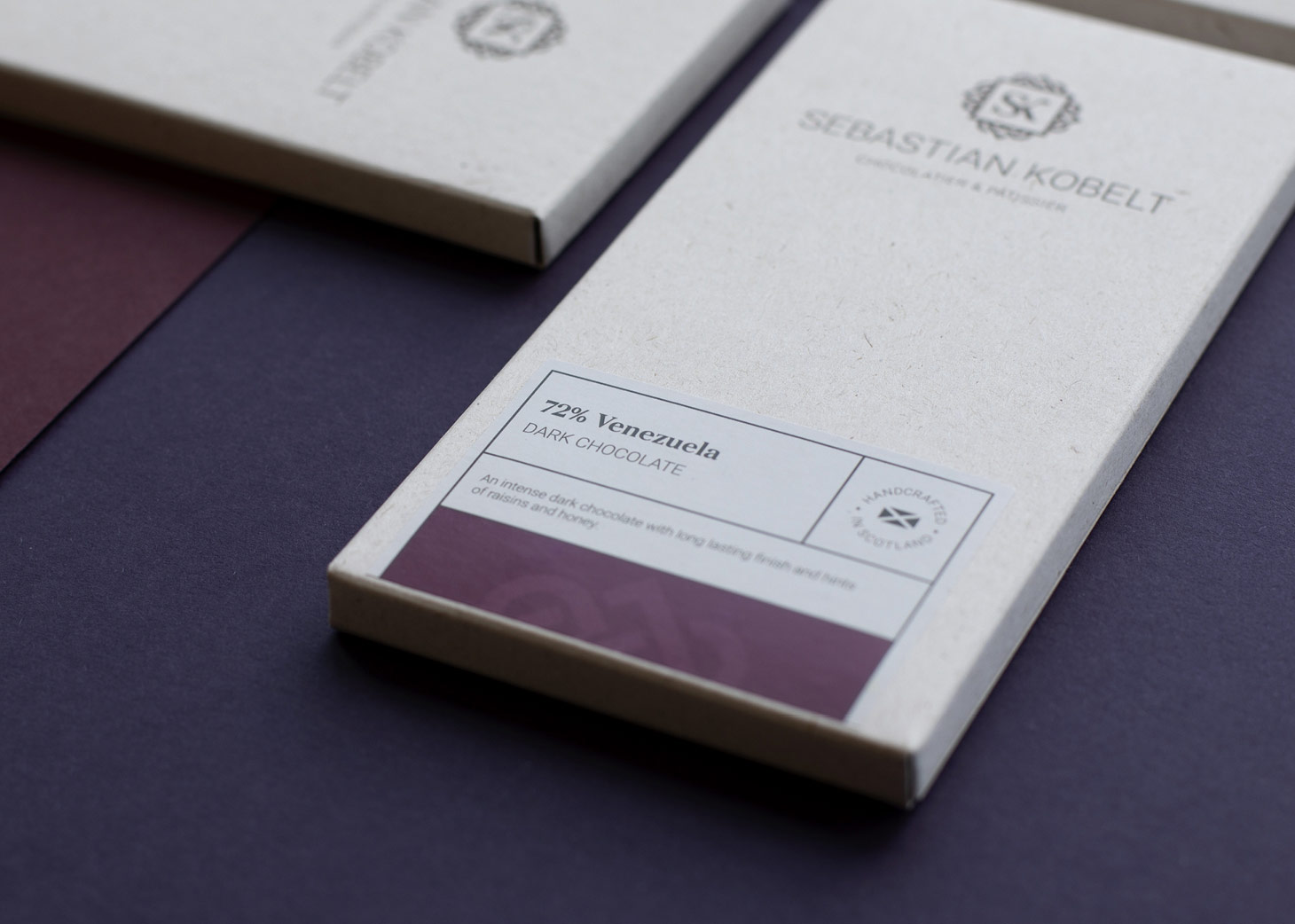
We were commissioned to create a logo design, branding and bespoke packaging for Sebastian Kobelt’s extensive range of chocolate products.
Caption here
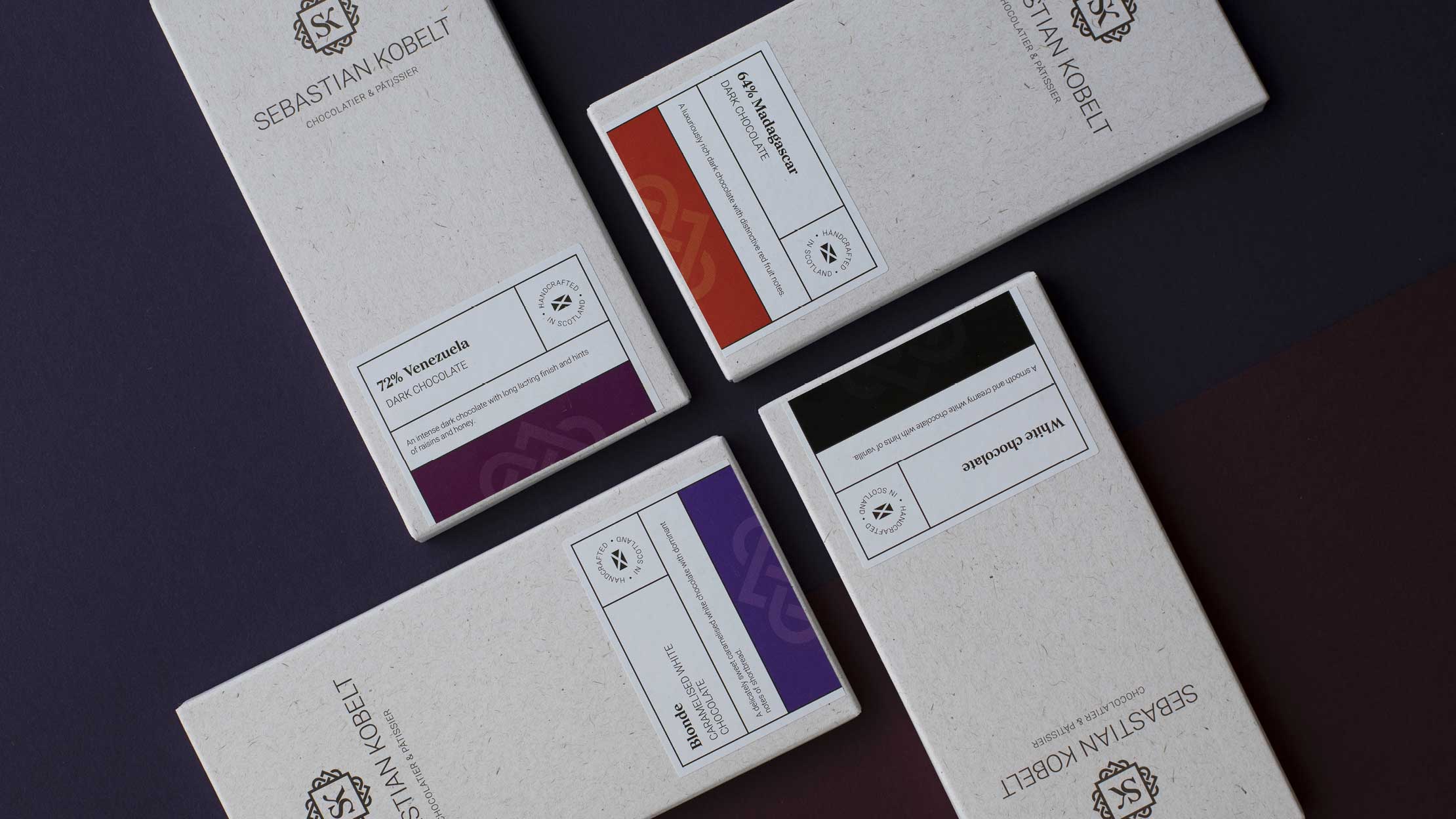
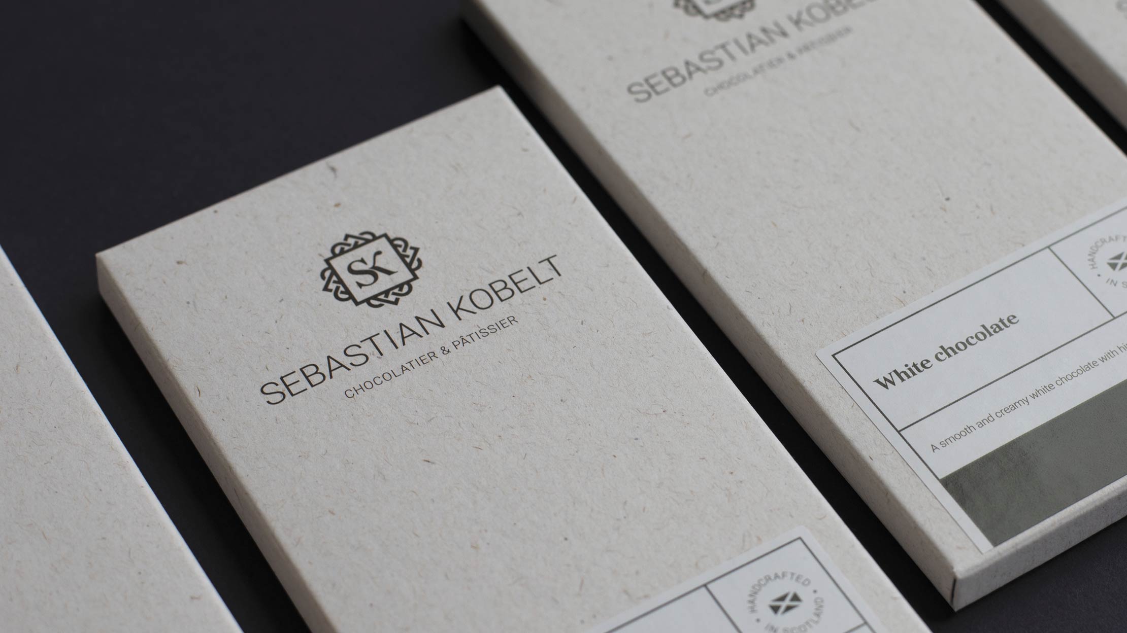
The logo marque is crafted from a monogram using the initials SK and is encased within ornate Celtic style knots. The stylised design acts as a nod to the brand’s Scottish base and alludes to the premium and decadent qualities of the products. This was reinforced by the dark chocolate colour selected for the logo, which compliments the various colourways chosen for the packaging.
The logo marque is combined with clean, modern typography, creating a subtle fusion of the traditional and the contemporary. Whilst the decorative design reflects the luxury products, the typography encompasses the professionalism of the brand, helping to position Sebastian Kobelt as leaders in the food and drink industry.
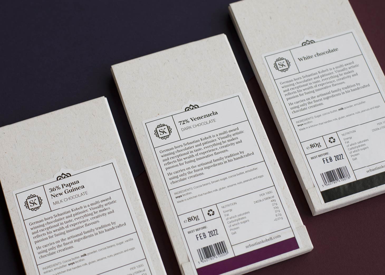
In order to reduce the company’s environmental impact, we opted for reusable jars for truffles and 100% recycled paper for the chocolate bars. We developed an extensive, carefully considered colour palette to visually differentiate products and flavours across the packaging. The colours were applied sparingly to create a refined design and reflect the premium nature of the products on-shelf. We combined a traditional serif typeface with a clean, modern sans serif typeface and utilised typographic hierarchy to highlight key information.
In addition to designing the packaging, we were commissioned to craft the copy to be displayed on the back of each piece of packaging. As the mouth-watering tasting notes and ingredients speak for themselves, the copywriting process primarily focused on Sebastian Kobelt’s wealth of experience and creativity, as well as touching on the family history that underpins the brand. This helps to set the brand apart in a competitive market, connecting and resonating with their target audience.
Success! We've received your message and will get back to you as soon as possible. We look forward to chatting to you.

Creative, friendly and responsive, they’ve truly delivered on what we asked for and more. We had a very tight turnaround on our project and they made it all happen in good time. I wouldn’t hesitate to use them again.”
Steph Wright
Project Development Manager
Cancer Innovation Challenge