What’s the deal with mobile-first design?
By Ben Walker on 30 May 2018
For a long time in web design, many designers approached the creation of new websites or email newsletters by designing for desktop first. Back in the day this made sense, since most people used the internet on their computers and would therefore mainly visit websites whilst sat at a desk with a massive screen in front of them.
However, nowadays, that powerful little computer in your pocket has changed everything. The rise of the smartphone has meant web design has had a serious rethink. And any web designer worth their salt knows how important a mobile optimised website is now.
Did you know mobile internet usage surpassed desktop back in 2016? With 1.2 billion mobile web users globally, for businesses, a mobile responsive design can no longer be seen as a secondary goal or be relegated to the would-like-to-have category. An optimised website is essential for any business today. Which is where mobile-first design comes in.

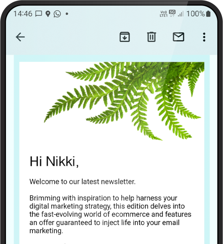
In simple terms, mobile-first means creating a digital experience (like a website or email newsletter) for mobile before designing it for desktop. The idea is you design for the smallest screen and work your way up. One of the greatest benefits of mobile-first design is that it’s an excellent way to create a responsive or adaptive website.
Why design mobile-first?
As well as ensuring your shiny new website is lovely and mobile responsive, mobile-first design also comes with a few other benefits…
- It gets the tricky bit out of the way and lays the foundations for further designs. Designing for small screens poses all kinds of challenges for you and your web designer. But if you can work through these barriers at the very start of the design process, the problems are addressed and taken care of straight away. Paving the way for a smooth website build going forward.
- If it looks good on mobile – it looks good on all devices. Designing for mobile forces you to create clean, simple design, easy to follow navigation and clear calls to action – all the important ingredients in a super user-friendly website.
- It helps you prioritise what content is most important to your audience. Rather than starting off with a huge batch of content and trying to work out where you can cut it down, you distil your content into the most important pieces of information, then add to it later. This means your message is clear and powerful, and won’t get lost or misinterpreted throughout the website build.
- Did we mention mobile optimisation is crazy important? It’s worth saying again – if your website doesn’t look good on a small screen, your customers will go elsewhere. Responsive design and a mobile-first approach are a match made in heaven.
So starting lean and powerful, then scaling up, is a key feature of mobile-first design. You’ll be adding to your design, rather than taking elements way – in the design biz we call this concept ‘progressive enhancement’.

The beauty of mobile-first design is it forces you to really put yourself in the shoes of your customers. It makes you think about how your customers use your website in different contexts – for example, they may be using mobile on the go for quick answers, but then want a more in-depth description of your service or product when they are sat down at their laptops. Mobile-first website design accounts for all types of visitor.
The fact is, mobile usage is so widespread these days that some of your potential customers will only ever see your website on their mobile phone. There’s a thought. So designing for smaller screens is more than just a trend – in today’s digital landscape it’s an absolute necessity.
Mobile-first design isn’t the future, it’s the right now.
Talk to us about creating your new website today, contact us.
Thank you
Success! We've received your message and will get back to you as soon as possible. We look forward to chatting to you.
“The friendly and professional Firefly team worked closely with us to develop and refine a clear style for our quarterly print and digital journals.
The team listened carefully to our needs and quickly responded to any queries and changes we requested. We are really happy with the end result, and with circulation increasing every month, it would seem our readers agree!
Sarah Brady
Brand Manager
Eyecare


