Chocolate packaging unwrapped
By Ben Walker on 04 March 2022
In today’s competitive landscape, chocolate packaging has become a canvas, an opportunity for brands to distil their unique personality and tell consumers exactly why they should pick them.
For those of you with a sweet tooth and an eye for design, we’ve created a shortlist of ten UK based brands we think are killing it with their irresistible packaging.
We feel a serious cupboard restock on the horizon…
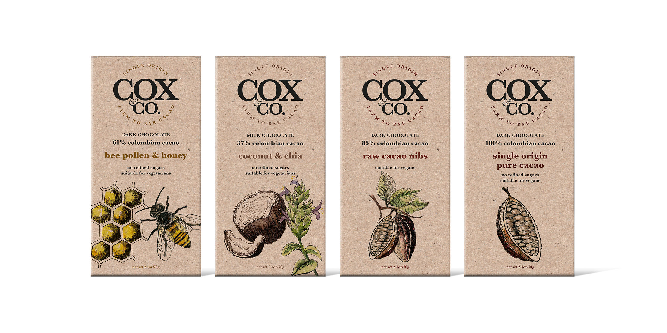
Cox&Co
Ethical and delicious, Cox&Co’s fully sustainable packaging blends intricate illustrations with traditional typography to create a natural, handmade look and feel. Aside from being visually pleasing, the illustrations act as a nod to the origins of the chocolate, reinforcing the brands ‘farm to bar’ approach.
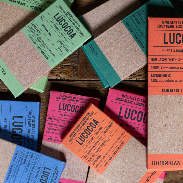
Lucocoa
North London-based bean to bar brand, Lucocoa, have gone back to basics with their modern, understated packaging. Simple but effective, they use vivid block colours and a combination of typewriter style and bold block typography to highlight key information about each bar, from its origin to tasting notes.
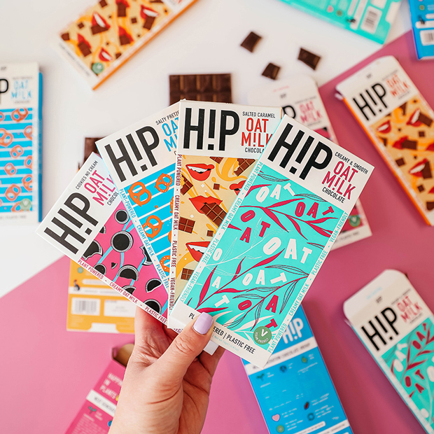
H!P Chocolate
We’ve seen many chocolate brands use illustration to convey their individual personalities, and we can see why. The striking colours and playful patterns H!P use to distinguish their mouth-watering flavours make the plant powered chocolate bars instantly stand out on shelf and online.
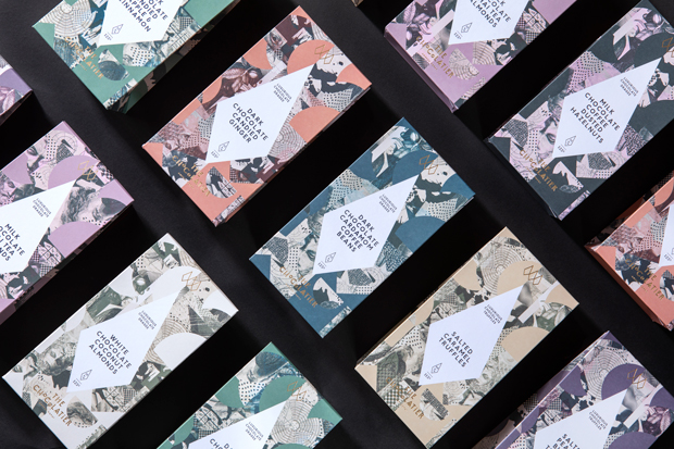
The Chocolatier
Playing with pattern, The Chocolatier have positioned themselves at the premium end of the market with their opulent packaging. The brand have fused cut-out geometric shapes with detailed, hand-drawn illustrations to create a collage effect, whilst the subtle use of gold foiling and art deco logotype allude to the luxurious chocolate within.
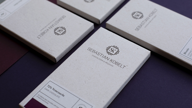
Sebastian Kobelt
We had the pleasure of designing artisan chocolatier and pâtissier, Sebastian Kobelt’s, logo and packaging. Whilst the stylised, Celtic inspired logo reflects the brands Scottish roots and the decadent qualities of the chocolate, the refined design, clean logotype and muted colour palette add a contemporary edge.
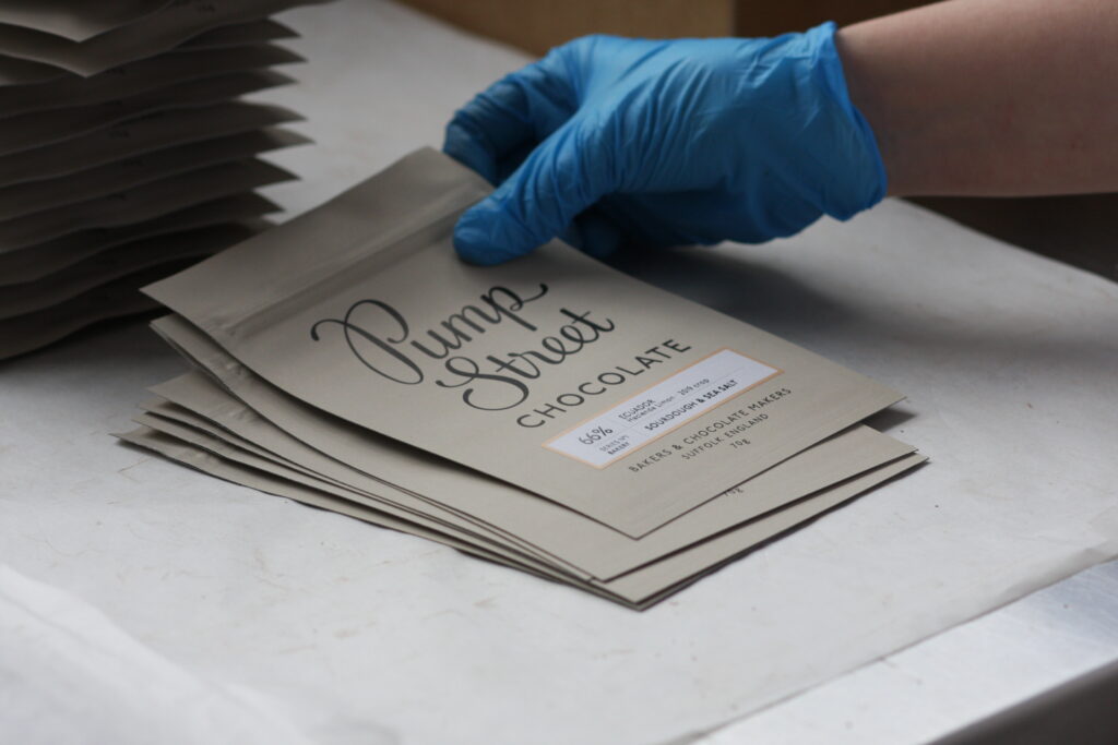
Pump Street Chocolate
Suffolk-based Pump Street Chocolate have moved away from the traditional bar with their minimalist packs of craft chocolate which can be satisfyingly teared open. The stone-coloured background and soft accent colours contribute to the effortlessly stylish design, perfectly balanced by bold, retro typography.
Montezuma’s
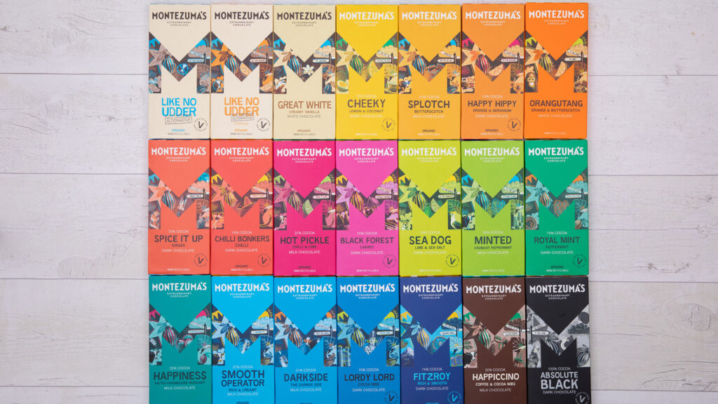
Bursting with character, Montezuma’s eco-friendly packaging has certainly made its mark. It’s impossible not to notice these delectable chocolate bars with their florescent colours, innovative names (‘Spice it up’, Happy hippy’ and ‘Like no udder’ to name a few) and captivating illustrations housed in their bold, trademark ‘M’.
Goupie
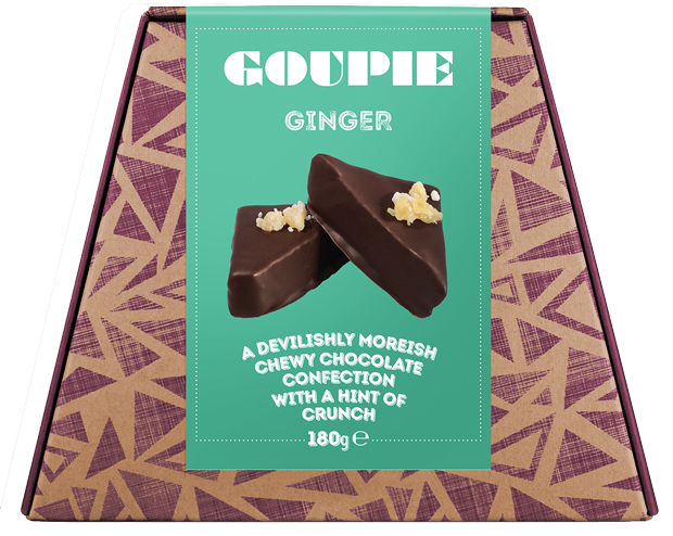
This devilishly moreish Kent-based brand use 100% recyclable packaging for their uniquely shaped cartons, adorned with a regal purple geometric print. Whilst the card packaging contributes to a handmade aesthetic, the bright colourways, block typography and photography of the treats within ooze indulgence.
Seed & Bean
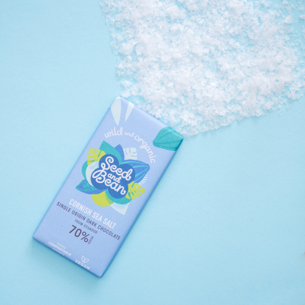
In line with their adventurous flavour combinations, Seed and Bean are renowned for their bright colour palettes, handwriting style typography and playful block illustrations. Brimming with character, the eye-catching packaging proves that you can indeed have both style and substance.
Chocolarder
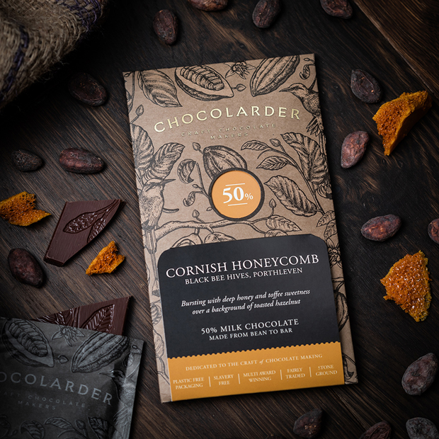
Before we wrap up, let’s dive into Chocolarder. The dark, rich colours combined with the use of gold foiling for the logotype evoke elegance and luxury. The detailed, hand-drawn illustrations of cocoa pods and leaves reinforce the ethos behind the brand, who source organically grown beans from family run plantations.
We understand the monumental impact packaging design can have. If this scrumptious selection has inspired you to invigorate your own packaging, please don’t hesitate to contact us, we’d love to chat to you about your project.
Thank you
Success! We've received your message and will get back to you as soon as possible. We look forward to chatting to you.
“Firefly has been a pleasure to work with. They did a wonderful job of producing a design that reflected the brief outlined and delivered great options for us to choose from. They worked quickly, efficiently and were very patient with us! We are delighted with our new brand.”
Kaisey Murphy
Programme Co-ordinator
Edinburgh Surgery Online
