
7 great big email newsletter template fails
By Ben Walker on 04 May 2018
Creating a stand out newsletter template takes time, experience and know-how. It’s an integral part of your email marketing campaign, and if done correctly can reap enormous rewards for your business.
However, for some reason, many companies are losing sight of best practice when it comes to email templates. So we’re here to set the record straight. Let’s dive into seven of the most common mistakes businesses make when designing their email newsletter template.
Mistake number 1: Going off brand
You’ve spent a lot of time getting your website, social media and advertisements perfectly on brand, so the last thing you want to do is go rogue with your email marketing.
Logo, font and colour scheme should all be in line with your brand guidelines. And don’t forget copy – your tone of voice needs to be on point too. Imagine your email subscribers opening an email from your company only to not recognise your brand and think an imposter has somehow gotten into their inbox! Not cool.
Building a brand and creating a trusting relationship with your customer base is all about consistency.
Mistake number 2: Not putting content first
Before you get a shiny new email template, it’s important to know approximately what content (and how much of it) you’re going to use to populate your emails. The so-called ‘content-first’ approach is popular in digital communications for good reason.
The content within your email is what’s going to communicate important messages to your customer base, and ultimately convince them to buy your product or service. The design is then going to make the content look as appealing as possible and contain visual cues to help your customers take the next step. That’s why we make sure we’ve always got a strong brief to work with when we set out to create an email template.
Mistake number 3: Email width is way too wide
Ever had an email that just doesn’t display properly on your screen? Nobody wants to have to scroll sideways to read an email. Industry standard for email width is 600px wide, so stick with that and you’ll be just fine. Which leads us nicely to our next point…
Mistake number 4: Not mobile optimised
Just like your website, your emails should be coded and optimised for viewing across multiple screens and devices. And if your email newsletter isn’t mobile optimised? Well, that’s got unsubscribe written all over it.
Nowadays, the vast majority of us check our emails on the go, and it’s estimated 56 per cent of us read our emails on our phones. And we check them frequently. There’s a lot of competition out there in the email marketing world, so it’s absolutely essential your email looks good on a smartphone screen.
Mistake number 5: Confusing calls to action
Talking of competing with other businesses, you shouldn’t lose sight of the objective of your email marketing. If you want customers to click through to your website or purchase a product, buttons, arrows, images and all other design elements must quickly capture their attention and provide an incentive.
Firstly, the location of your call to action is super important. It should be central and obvious. It should also be above the fold – meaning users don’t have to scroll to click a button to take the next step.
Secondly, the call to action should be eye-catching. The button must stand out using colour, graphics, or a combination of both. The text on the button should be succinct, to the point and easy to understand. Usability whizz, Jacob Nielsen, has underlined the importance of combining clear visual cues with a strong call to action, particularly in trendy flat design.
Mistake number 6: Forgetting the footer
If you haven’t included social media links in your footer, you’ve missed a pretty big trick. Promoting your social channels helps you build a tribe around your products or services and create a community which you can market to in the future. Including social buttons in the footer of your email template is exactly where the majority of your readers will expect to find them.
Your footer is also a place where you can sign off your email with your own distinctive email signature. Treat it as a kind of electronic business card, and include your contact details.
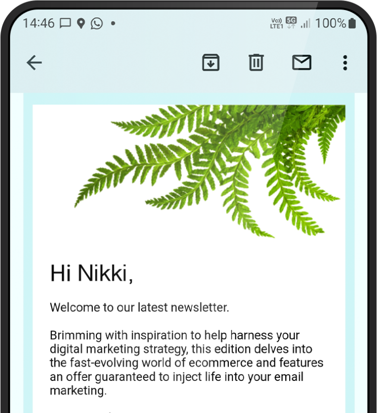
Mistake number 7: Unrelated images
In recent years, email communication has taken a significant shift towards image-driven content. High quality, relevant images that add to your marketing message can make your email even more appealing. Images that don’t relate directly to the content of your email can prove confusing, or worse, they could be perceived as spam.
A word on stock images – if it looks like a cheap stock image, don’t use it. Some stock images are great, but make sure they ooze the quality and professionalism you want your customers to associate with your business.
So there you have it – seven of the most common email newsletter template fails, and exactly how you can avoid them. Stick to relevant images, strong calls to action, and, of course, always optimise for mobile. Get in touch if you’d like to talk about email marketing with us.


Thank you
Success! We've received your message and will get back to you as soon as possible. We look forward to chatting to you.

“Firefly has been an absolute joy to work with. We commissioned them to create a promotional animation for us and on seeing the storyboard, we were so impressed with the work they did that we ended up contracting them to design a series of printed materials too.
Creative, friendly and responsive, they’ve truly delivered on what we asked for and more. We had a very tight turnaround on our project and they made it all happen in good time. I wouldn’t hesitate to use them again.”
Steph Wright
Project Development Manager
Cancer Innovation Challenge